yeah, thats a classic nightmare situation, you’d think theyd have backups or something
Ordinary-Chain-80472025-11-01 00:54
Then after the 10th Fiege was like “Ok you know what!? Just make it basic as all hell! I don’t care anymore!”
StoppedListeningToMe2025-11-01 12:25
Should have lost the script instead. Can't put my finger on why exactly but I think this might be my least favourite of the recent Marvel movies. I was bored watching it, similarly withe the Marvels. Maybe I'm just getting old though, oversaturated with Marvel?
Desperate_Ad_92192025-11-01 14:24
That's because you need to watch Falcon and the Winter Solider to understand part of the plot. And you can tell heart wasn't put into it. Should have got Ryan Coogler to help fix it. He knows how to toe the line Julius Onah does not.
StoppedListeningToMe2025-11-01 14:35
I watched Falcon and The Winter Soldier. It was ok, some parts were great, some so so but overall very enjoyable watch.
The movie on the other hand not so much. I think you might be onto something with that heart part
Retro-scores2025-11-01 16:18
Should’ve lost the film file.
yaassensei2025-10-31 23:36
There are a lot of trash and a lot of bangers
Salty-Coffee46082025-10-31 23:38
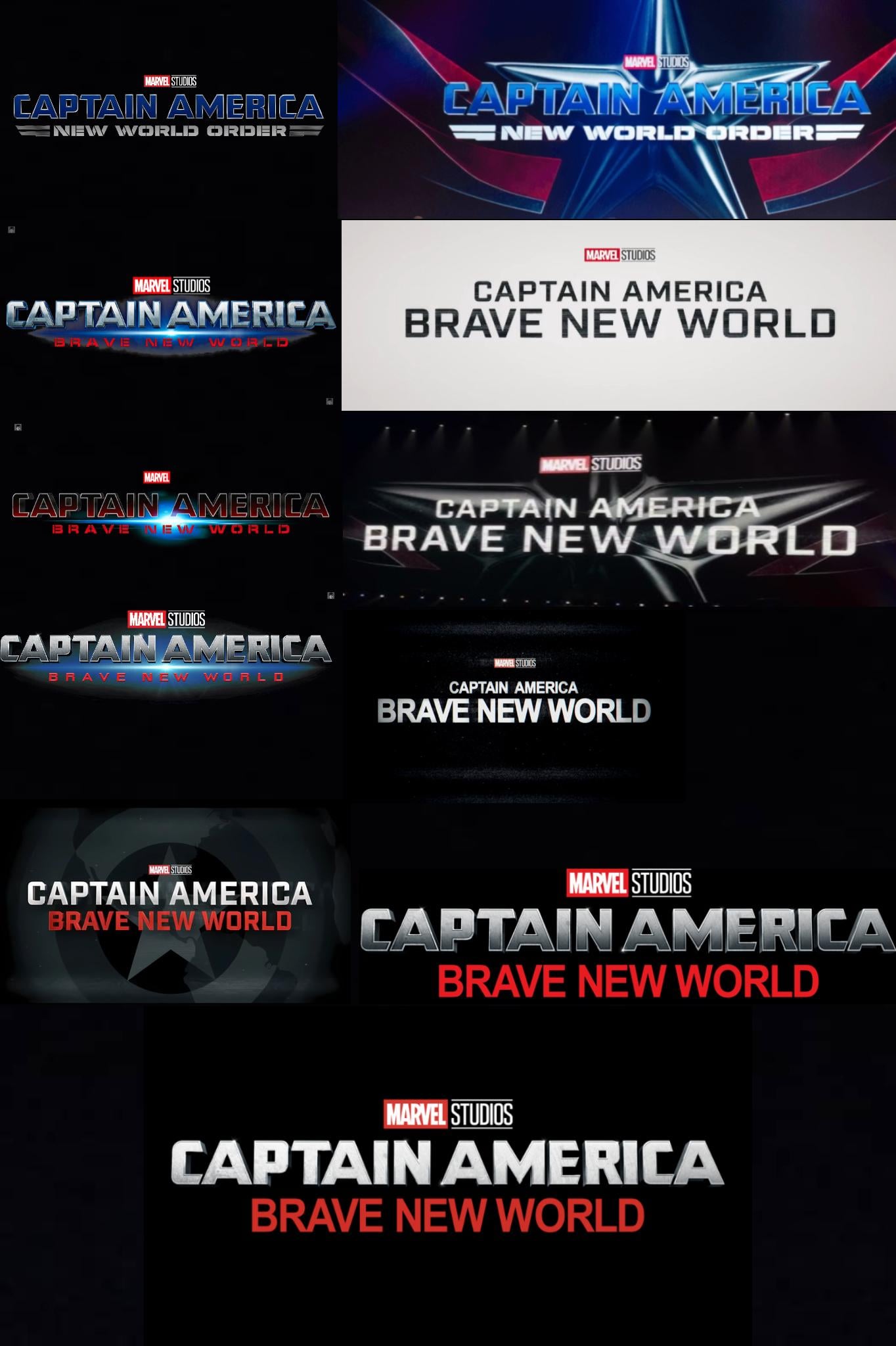
And they went with the worst one
Actual_Ad_66782025-11-01 00:31
Absolutely! The font of the subtitle couldn't be more boring.
AlleRacing2025-11-01 01:47
**Papyrus!**
Beanmaster1152025-11-01 05:41
*NYEH HEH HEH! I’M THE ROARING KNIGHT!
Real_FishyXY2025-11-01 17:32
I KNOW WHAT YOU DID
RepresentativeName182025-11-01 00:39
As an epileptic, I agree
smcl2k2025-11-01 00:46
I'm going to say that the 3 which are pretty much impossible to read are definitely worse.
123boopboop2025-11-01 00:46
Honestly I feel like at a certain point they stopped trying to make it epic and started damage control 😭 Like it was a fun action movie but . . . I think even the people involved knew that the final cut was not going to win an Oscar
Phyginge2025-11-01 04:01
Film or logo?
Salty-Coffee46082025-11-01 04:09
Logo, film was just mid
PolarWater2025-11-01 15:11
Fucking Helvetica...
Herzatz2025-10-31 23:39
It perfectly reflects how this movie was changed over and over and over to be the big piece of shit it is.
SweatyEddie1232025-10-31 23:44
It wasn’t that bad
HUGO-THE-BEAR2025-10-31 23:47
Wins the most okayest award
Comic_Book_Reader2025-10-31 23:53
Yeah, all things considered, it wound up being perfectly fine.
123boopboop2025-11-01 00:50
I was very fine watching it on streaming. It was a fun action movie. It didn't change my life.
aaufooboo2025-11-01 01:41
One of the MCU movies of all time.
eagledog2025-11-01 05:25
It was certainly a movie
Variation_Afraid2025-11-01 00:11
That’s a little over dramatic it wasn’t good but wasn’t bad, and it definitely was not a “ piece of shit”, that’s basically saying kraven and morbius were masterpieces lmao
megalogo2025-11-01 00:25
Oh no, you seem to have enraged the "Its not that bad" and "Its actually pretty good" hivemind
aaufooboo2025-11-01 01:40
Honest question. Did you refer to folks with different perspectives than yours as a "hivemind" because you feel, in this instance, those users are not thinking for themselves and you are? Was it a generic argument or did you pick that word to convey a point of individualism on your part?
megalogo2025-11-01 02:21
Hellow fellow hivemind user! Hope you doing okay
puto_escobar2025-11-01 02:32
Your mom liked you better as an idea lol
megalogo2025-11-01 02:50
Oh wow, this one is feisty!
aaufooboo2025-11-01 03:17

puto_escobar2025-11-01 02:32
Dudes a dipshit and does/says dipshit things
DecoyOne2025-10-31 23:45
First one is my favorite - not perfect, but on to something. Feels kinda Air Force vs. Army for Steve. Others are hit or miss, but generally not a great lineup.
That-Technician-52712025-10-31 23:49
In my opinion, they should have kept the title "New World Order." The only thing I would change is the logo; they gave it a design that's a copy and paste of the Captain America: The Winter Soldier logo (although it doesn't look bad, you can see the recycling).
Level-Ladder-43462025-11-01 00:10
Yeah, I felt like they only called it Brave New World because then the title is a reference.
DecoyOne2025-11-01 00:20
I assumed that nWo was unhappy and threatened to send Kevin Nash after Feige
Canazza2025-11-01 00:22
I assumed it was because they just wanted a new word order
ohTHOSEballs2025-11-01 02:13
Hollywood Hogan almost leg dropped RDJ.
KozyHank992025-11-01 02:55
"You wanna war?!"
CaptainRex_CT75672025-11-01 01:10
“New World Order” is also a reference to an episode in The Falcon and The Winter Soldier.
eagleblue442025-11-01 11:56
I'm guessing that was intentional. They wanted people to draw comparisons to winter soldier as not only is it considered one of the best MCU movies but they also drew inspiration from it by making brave new world a political thriller similar to winter soldier.
RDDAMAN8192025-11-01 02:40
First one’s design also matches the other Cap movies. It was perfect
mattr19862025-11-01 07:54
The 2nd one, (top right) looks like they could just replace “America” with “Marvel” and it would fit alongside Captain Marvel’s logos
GenGaara252025-11-01 13:07
Yeah the little "wings" either side of the subtitle give Air Force vibes, which absolutely vibes with Sam taking over and being the flying Cap.
Thomas_JCG2025-10-31 23:48
And the one they used is something that could be done on MS Paint. This movie had no fighting chance.
InevitableWeight3142025-10-31 23:51
Man, new world order was such a cooler name. Ive said it once and I’ll say it again, brave new world sounds like a brochure given to kids about puberty
123boopboop2025-11-01 00:55
I feel like they're both odd choices. New World Order is at least a bit more original, Brave New World is such an odd choice as a reference. It's not like a "trendy" or "cool" book so much as a very serious political commentary that probably not a lot of young people have read outside of school.
New World Order imo implies Hydra, and we already had that plot line. Like having seen the movie I don't really feel either title?
I don't envy the marketing people for this movie. It was probably a nightmare to work on and they probably were balancing a lot of strong opinions.
Kodiak_POL2025-11-01 02:02
>It's not like a "trendy" or "cool" book
Guardians of the Galaxy as characters and title were neither trendy nor cool when they released too.
So was Andor.
PhotoBonjour_bombs192025-11-01 02:08
It’s also the name of the first episode of FATWS
Vakobi2025-10-31 23:52
Should’ve stuck with the first one minus the name change. The new one is just so boring it’s astounding it came from Marvel Studios
OblivionArts2025-10-31 23:55
Remember when this was initially teased as new world order? I do
ernie-jo2025-10-31 23:57
And they landed on the most generic one haha
123boopboop2025-11-01 00:52
bro I feel like a movie with this type of plot became so topical by the time it came out that they made it more generic out of fear of Discourse. I bet the original script had a lot more to say, and then it became like "well shit, how do we cut this in a way that doesn't present a stance on current politics."
I think they succeeded on being generic but not in making an especially well-written movie!
_PM_ME_PANGOLINS_2025-11-01 10:34
COVID did that to Falcon & The Winter Soldier, and the Ukraine invasion did it to Secret Wars.
StarWarsPlusDrWho2025-11-01 16:08
So it looks like they actually *didnt* land on the most generic one. If you look about two-thirds down the collage, it looks like there’s a version where they were playing with the *entire* logo using the basic word doc font; even the “Captain America” part.
What I think happened is the designers had some kind of conflict; one person with some sway on the team was like “this movie represents a new paradigm for Captain America, we need to strip away all the glamor and go back to basics!”
And then another person was like “buddy I like where your head’s at, but we need the logo to be recognizable because at the end of the day we’re trying to get butts in seats”
And there must have been some infighting between those two points of view, and maybe some backlash from fans mixed in, because the final logo was an absolute “too many cooks” compromise. A recognizable font for the main title, generic font for the subtitle.
eagc72025-10-31 23:58
Not even the logo was safe
StupidMastiff2025-11-01 00:10
This was the most boring, forgetful, bland, do nothing, say nothing film in the MCU, the logo was the least of it's issues.
Fabulous_Spinach2025-11-01 00:51
But it is interesting how the logo shifts indicate the directionless production of the movie… they knew they wanted to make a Captain America movie starring Anthony Mackie but couldn’t settle on anything else, not even the most basic visual identity for the movie, and when it was finally done, they didn’t know how to market it.
aaufooboo2025-11-01 01:38
While I disagree with OP's contention about BNW being **the most** bland, I absolutely agree that the logo shifts echo what state the movie was in at the time. The end product was...*fine*. I enjoyed moments and could very much tell what scenes were shoehorned in via reshoots.
Adipay2025-11-01 07:20
A political film that was not "brave" enough to be political.
StupidMastiff2025-11-01 15:31
Exactly. It should have been about what it means for Cap to be black, and him kicking the shit out of racists.
Ajshan2025-11-01 00:17
That's how many times they changed the movie
SphmrSlmp2025-11-01 00:20
I think they nailed it in the first one.
Not a fan of the red colour subtitle though. Idk just doesn't feel easy on the eyes.
sketchampm2025-11-01 00:24
Brave New Bird
MaxReb02025-11-01 00:59
Ah - a fellow Weekly Wackididoo!
sketchampm2025-11-01 02:28
I’m a pig rolling down a hill!
Aromatic-Cupcake48022025-11-01 00:27
Not even the logo could escape the extensive reshoots
Optimus_Lime2025-11-01 00:32
About as memorable as the actual movie
Estrezas2025-11-01 00:35
At some point in there, they realized the problem wasnt the logo.
factualopinion22025-11-01 00:38
I guess its better they didnt wasted a cooler title, "new world order" on this
Live_Angle46212025-11-01 00:48
Always indicative of quality
/s
BigBallsBiggerBrain2025-11-01 00:49
This is what it looks like when you don’t believe in yourself.
Armandonerd2025-11-01 00:52
I wish it was called New World Order
Illustrious-Sign30152025-11-01 00:52
New World Order sounds way cooler than Brave New World
gcg2265082025-11-01 01:22
They really nailed it the first time
BurnZ_AU2025-11-01 02:03
Both New World Order logos are better than the final one.
Top right is my favorite. Should’ve went with that one.
mexicat20002025-11-01 02:19
Which one did they go with?!
Abbi_Rose2025-11-01 02:21
Wish they put this much energy into the actual movie
iamahandsoapmain2025-11-01 02:23
And the one we got is utter dogshit
PhillipJ3ffries2025-11-01 02:42
First one is the best then it gets progressively worse
imiller92025-11-01 03:04
Don’t forget it originally was Serpent Society. Absolute disaster
CaptHayfever2025-11-01 03:32
Civil War was originally Serpent Society too.
Vaportrail2025-11-01 03:17
I'm sure that's not all they changed.
CaptHayfever2025-11-01 03:33
There's a ton of movies, including in the MCU, where the in-film title card looks *nothing* like the promotional logo.
Phoeptar2025-11-01 04:25
You are showing a lot of repeats here. If you count small changes made for specific trailer themes then you’ll find much the same thing for many other marvel movies.
BoredAndLonely962025-11-01 07:14
NWO was a better title.
ZoNeS_v22025-11-01 10:02
The film changed as much as the logo.
SonXal2025-11-01 10:08
I have yet to see this film but I preferred the original New World Order subtitle
offgridyungin2025-11-01 10:23
All those changes just to be mid
Clockwork-Penguin2025-11-01 10:47
Insane to me they even considered using the title New World Order
Strikeout5542025-11-01 13:02
That font for the last two.. man what were they thinking?
CobaltAnimator2025-11-01 13:24
imo the best one was the black on white one
felt really cool and that's the one that got me excited for the movie from the trailer
and then they went with the most bland one possible istg
BulletproofHustle2025-11-01 13:32
And there were more reshoots than logo changes. 🤓
TheTangerineLounge2025-11-01 13:38
New World Order sounded pretty cool. Only if it was kept and was backed with a MI: Fallout-esque plot and direction.
I often wonder what will be the odds of McQuarrie making a Brian Braddock movie starring Henry Cavill.
dr_henry_jones2025-11-01 15:19
You forgot when it was called serpent society
Retro-scores2025-11-01 16:17
They should’ve changed the movie.
legion_XXX2025-11-01 20:31
Needed some plot changes too.
Ok_Sorbet52572025-11-01 21:13
did they have to change the name because hall and nash wouldnt put cap over?
Commentaires
—Feige, after being told for the 10th time they accidentally deleted the logo
The movie on the other hand not so much. I think you might be onto something with that heart part
New World Order imo implies Hydra, and we already had that plot line. Like having seen the movie I don't really feel either title?
I don't envy the marketing people for this movie. It was probably a nightmare to work on and they probably were balancing a lot of strong opinions.
Guardians of the Galaxy as characters and title were neither trendy nor cool when they released too.
So was Andor.
I think they succeeded on being generic but not in making an especially well-written movie!
What I think happened is the designers had some kind of conflict; one person with some sway on the team was like “this movie represents a new paradigm for Captain America, we need to strip away all the glamor and go back to basics!”
And then another person was like “buddy I like where your head’s at, but we need the logo to be recognizable because at the end of the day we’re trying to get butts in seats”
And there must have been some infighting between those two points of view, and maybe some backlash from fans mixed in, because the final logo was an absolute “too many cooks” compromise. A recognizable font for the main title, generic font for the subtitle.
Not a fan of the red colour subtitle though. Idk just doesn't feel easy on the eyes.
/s
felt really cool and that's the one that got me excited for the movie from the trailer
and then they went with the most bland one possible istg
I often wonder what will be the odds of McQuarrie making a Brian Braddock movie starring Henry Cavill.